

Analyzing the forex market for trading and understanding currency behavior is a skill traders need to improve. Your trading performance naturally improves as your technical analysis skills improve. Understanding charts is a universal skill which you can transfer from forex trading to other financial markets and take better decisions.
Learning technical analysis as a beginner will give you a solid trading foundation to make better decisions. Advanced traders, too, learn and improve their knowledge of forex trading.
This article explores charting and technical analysis fully.
You’ll find everything you need to become a better chart analyst.
What is a Chart?
A chart is a graphical representation of an asset’s price movement over time. Graphs are displayed for specific periods, ranging from a minute to decades.
Traders’ activities form charts. Thus, they accurately represent the market condition and decisions and provide useful data for traders to predict prices.
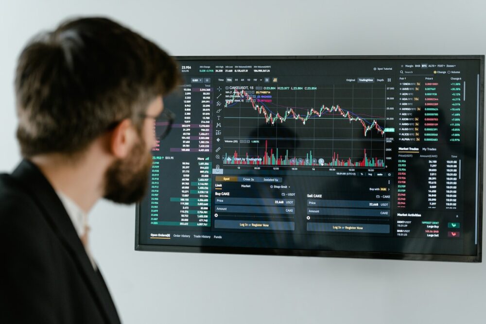
Charts are user-friendly, showing traders an efficient, easy-to-read, navigable graph of assets. Price movements appear from the left, moving towards the right so that the latest prices appear first from the right. All charts show an asset’s opening and closing price, demand and supply, and market sentiments. Every chart shows an aggregate of traders’ activities for human traders and trading robots (algorithms).
There are three types of charts that are commonly used:
- Line Charts.
- Bar Charts.
- Japanese Candlestick Charts.
Next, we’ll explore how each chart type works and how to analyze them.
1. Line Charts.
A line chart is the simplest chart in any financial market. It consists of a simple line connecting price levels in a continuous line. Line charts allow traders to visualize trends at a glance, observe price levels, and determine the prevailing market sentiment.
There are three types of line charts, simple, multiple, and complex, each having one, two to four, and more than four variables per chart. But the simple chart is commonly used in forex because it presents the simplest price representation. Line charts show only the closing price of assets and are sometimes called close-only charts for that reason.
How to Read Line Charts?
Line charts are constructed on the x-axis or horizontal axis of the graph against the price levels, which are built on the y-axis or vertical axis. That way, asset closing prices reflect on the price level, moving from the left to the right.
You read the chart from left to right or reverse, depending on the period you want. However, you can only get the latest prices from the right side.
Advantages.
- Clear, uncluttered chart.
- Easy identification of major trends, support and resistance levels, and some price patterns.
- No market noise, short-term speculations, and price volatility.
Disadvantages.
- No opening and closing price.
- Relatively less information about the market.
2. Bar Charts.
Depending on their display parameters, bar charts are called OHLC or HLC charts.
A bar chart is a vertical graph plotted against price levels, with horizontal bars showing the open price, low price, high price, and closing prices.
The length of the vertical bar also indicates the market volatility; the size increases or decreases according to the asset’s volatility. The low and high prices are displayed at the lower and upper extremes, respectively, while the open and closing prices are displayed on either side of the bar, between the lower and upper extremes.
The closing price is displayed on the right, while the open price is displayed on the left.
How to Read Bar Charts?
Set the chart to your preferred time frame and scroll to the period you want to view. Bar charts display price parameters as well as volatility. The chart looks clustered because of the horizontal bars, but it gets easier with practice.
Bar charts also show trends, volatility, and chart patterns. You can quickly identify popular patterns on bar charts, such as heads and shoulders.
Advantages.
- Simple to search for simple technical analysis patterns in shorter time frames.
- Visually compact and exact, showing situations, trends, and price levels.
Disadvantages.
- Not as easy to read as a candlestick chart or a line chart.
3. Japanese Candlestick Charts.
The Japanese candle chart is an improved bar chart version, showing better open, closing, high, and low prices. Candle charts also show volatility, trends, and market sentiments.
A candle has two important parts; the body and the wick (shadow).
The size of the body shows volatility, while the length of the wick shows the low and high prices and the opening and closing prices.
How to Read Candlestick Charts?
First, set up the chart. You can use colors to improve visibility. Then read the price level at which the opening and closing wicks touch and the size of the body. Candlesticks indicate a bullish move if the closing price is higher than the opening price and vice versa.
Advantages.
- Convenient and easy to read.
- Displays the most information.
- Offers deeper insight.
Disadvantages.
- It does not tell you which came first, the high or the low.
- It doesn’t display long-term prices.
Chart Patterns.
Chart patterns are recognizable movements that prices regularly form on the chart.
There are different patterns, but they can all be categorized according to the number of bars or candlesticks that create them. For example, there are single-candle charts, multiple-candle charts, and complex charts. Examples of charts include head and shoulders patterns, hanging men, shooting stars, etc. Chart patterns are also categorized based on the market sentiment they reveal; there are bullish and bearish chart patterns.
Combining charting with technical indicators is an effective way to improve this skill.
Final Thoughts.
Learning chart analysis will improve your trading performance, especially as you recognize chart patterns and major market moves.
You do need constant practice to learn and hone your analytical skills. Choose your preferred chart for analysis, or learn to read one or two to improve your analysis.